PROJECT DD
INTERACTION DESIGN ∙ VISUAL DESIGN ∙ MOBILE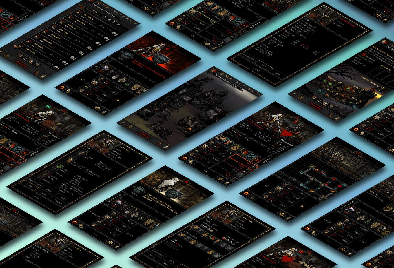
| CLIENT | Personal project |
| ROLES | Sole designer |
| BRIEF | Redesign the game Darkest Dungeon for mobile with a portrait orientation |
| END USER | Mobile gamers with an affinity to turn-based roguelike games |
| TOOLS | Figma, Adobe Illustrator, Adobe Photoshop |
DISCOVERY
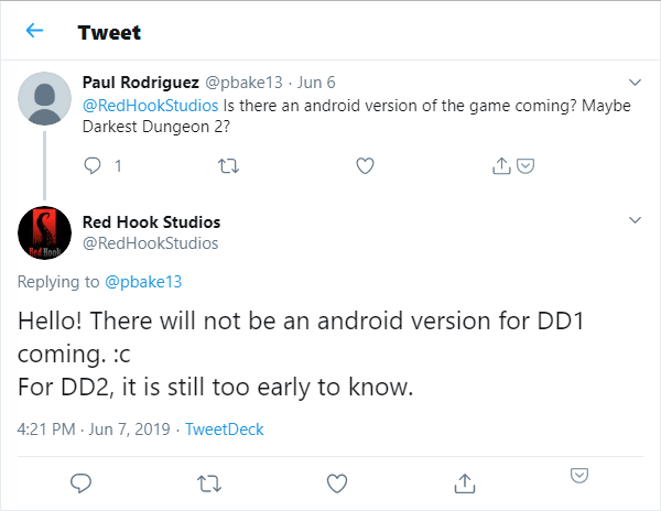
When Darkest Dungeon released in 2016, I was quickly entranced by it’s roguelike style and it’s gritty, and punishing mechanics. I have always enjoyed single player dungeon crawlers like Diablo and Torchlight as well as turn-based strategy games like Civilization. Combining those elements into Darkest Dungeon and coupling it with the great narration and art style made it one of my favourite games ever created. I will admit that I haven’t played it nearly enough to critique or fully understand the game with my measly 44 hours, but I have always wanted to get back into the game, I just never found the time to. What if there was a way for me to continue playing my session on my phone when I had to step away? This lead me to this project. Darkest Dungeon for mobile. It always made sense to me that Darkest Dungeon should be available for the phone since the roguelike mechanics translate so well to mobile interactions. I figured it was just a matter of time before either Red Hook Studios creates a port for Darkest Dungeon or they partner with another company to bring Darkest Dungeon to the phone like they did for the iPad. But unfortunately, Darkest Dungeon for mobile was never created and will likely never see the light of day since Red Hook Studios is working on Darkest Dungeon 2 and at the time of creating this project, Red Hook Studios themselves have stated that they don’t have any plans for an Android version for Darkest Dungeon.
With that information I took it upon myself to try to redesign Darkest Dungeon for the phone. This port had to feel and look like Darkest Dungeon and behave in the exact same way. This mobile version is meant to allow the player to continue playing their game while on the go. It is not designed to be the only way to play the game, but can be if the user so chose to. As an added challenge for myself and a way to understand mobile gaming better, I decided to also try and design the game in portrait orientation. Portrait orientation means understanding proper one-hand use interfaces and understanding what sacrifices can be made in order for the best user experience. In addition, this project would be a good medium to learn and practice using Figma, an interface design application that runs from the browser.
Goals:
- Proper Darkest Dungeon port to mobile
- Keep all of Darkest Dungeon’s look, feel and behaviours
- Portrait orientation for one-hand use interactions
- Creating the designs in Figma
EXPLORATION
Darkest Dungeon
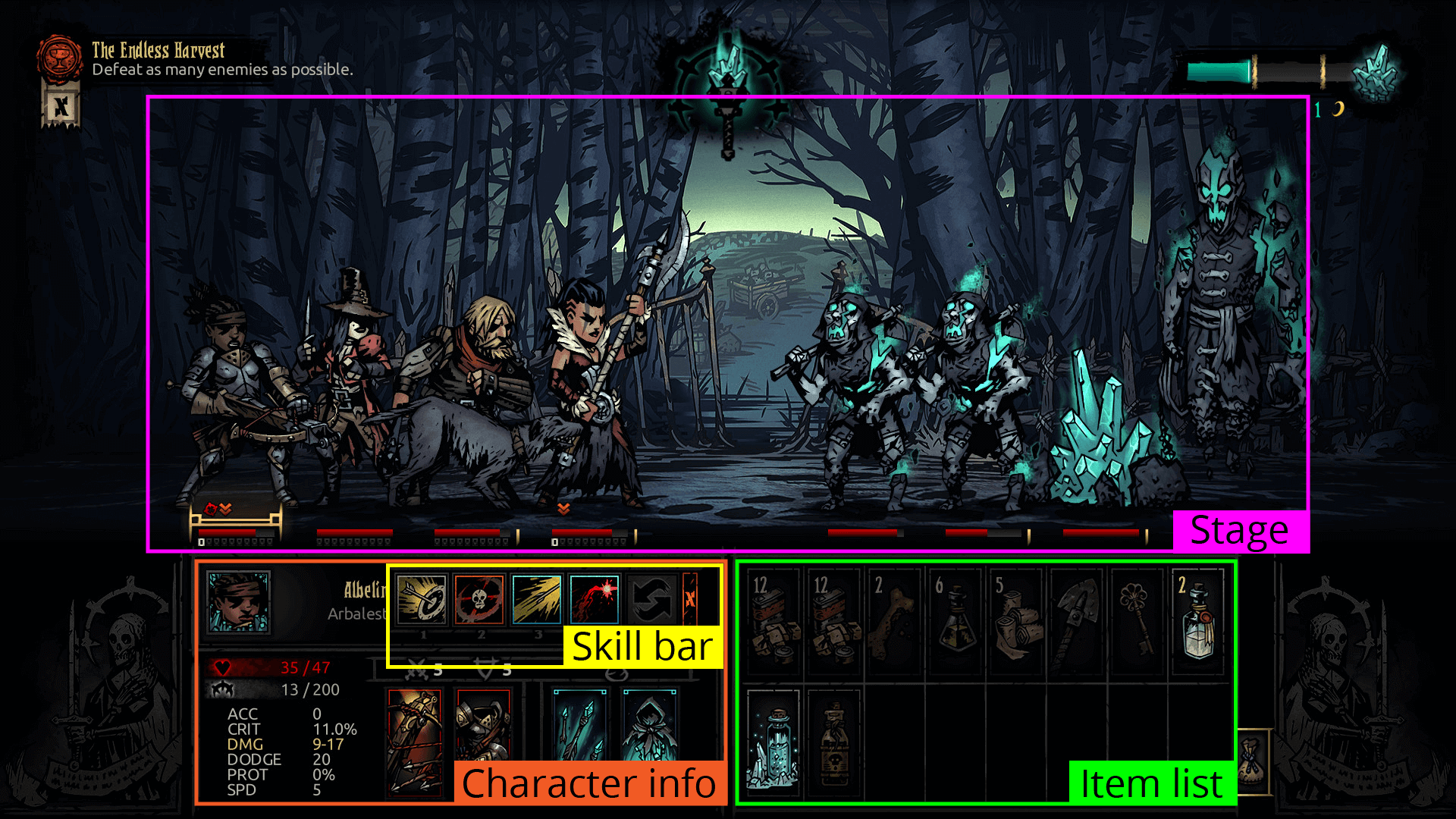
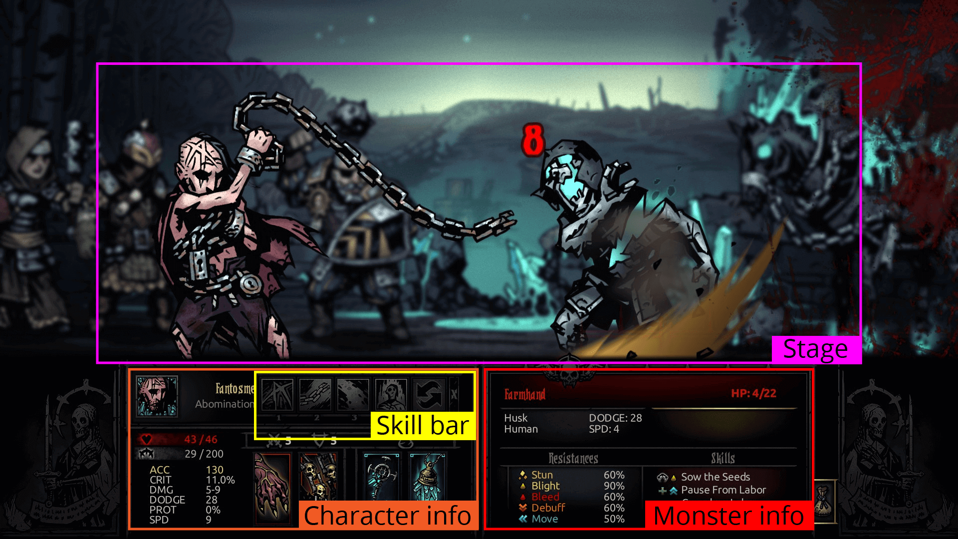
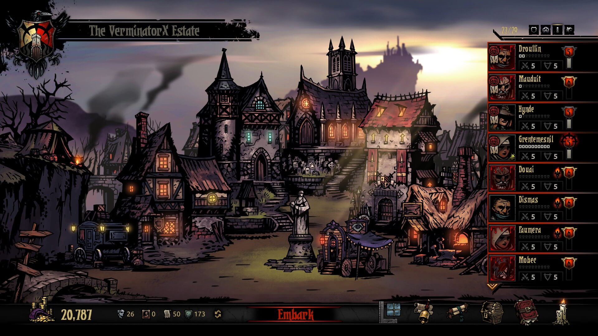
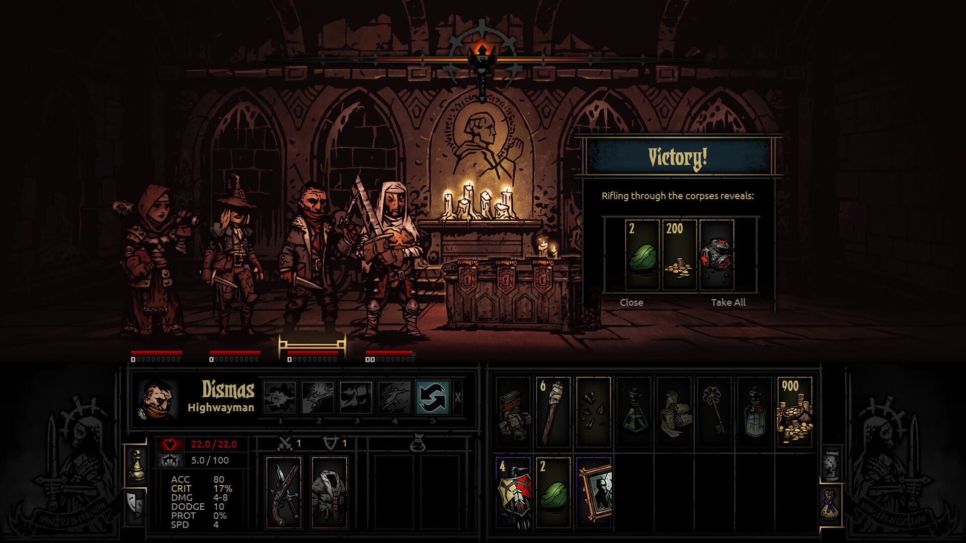
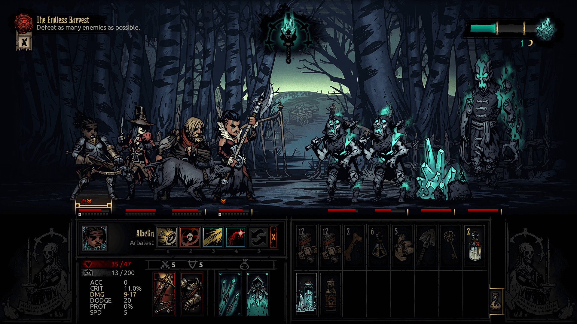
Research first started with playing Darkest Dungeon again. I took note of all the primary screens of the game and the features in each of them and ordered them in importance. For the purpose of this breakdown, I will be referring to different parts of the UI by name. The images below highlights the elements I am referring to.
- Stage
- Skill bar
- Item list
- Character information
- Monster information
| Hamlet | Embark | |
|---|---|---|
| Description | The main hub of the game which is used when not exploring a dungeon. The hamlet contains various buildings that allow the player to form, manage and improve their roster of heroes | the preparation screen where you pick the dungeon to explore, gather your provisions, and assemble your roster |
| Important |
|
|
| Maybe important | ||
| Not important |

| Exploration | Battle | |
|---|---|---|
| Description | the screen where the roster walks through the dungeon inspecting curios and making their way through obstacles and traps | the combat screen where the player manages their roster in a fight against the dungeon’s monsters |
| Important |
|
|
| Maybe important |
|
|
| Not important |
|
|
Mobile UI/UX
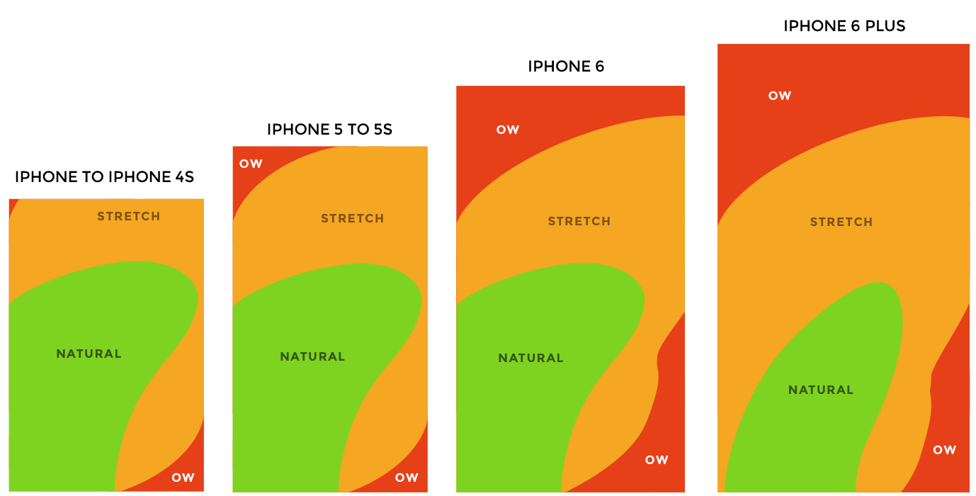
When designing for mobile, screen size limitations are probably the hardest to balance with the differing priorities in the games ui. Designers also have to prioritize what elements need to be easily accessible. In portrait orientation and one-handed use, elements at the top of the screen would either be too hard to reach or require the second hand to navigate properly. In addition, one-handed use usually means only using the thumb to interact. This poses problems like how far the thumb can reach and the common “fat finger syndrome”. Elements need to be within the thumb heat map and also big enough and spaced out enough to follow Fitts’ law. In addition, in order to limit the number of screens a user will need to navigate through, all sub screens should only be separated by one degree from the main screen. This means when a user opens a sub screen, there should always be an option to bring the user back to the main screen. This will help the user from getting lost in the UI and limit screen frustration.
Priorities and requirements:
- Elements within thumb heat map
- Elements large enough to limit fat finger syndrome
- Follow Fitts' Law
- One degree of separation from the main screen for all sub screens
Figma and conceptualizing
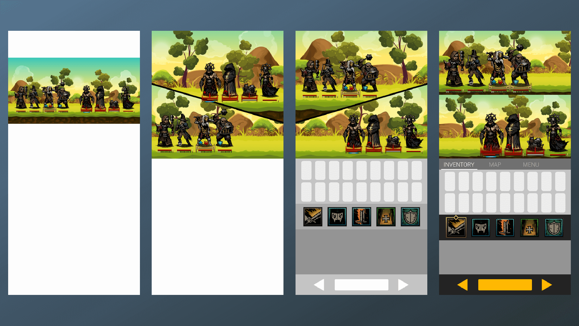
Figma is a browser based interface design application. Since it is browser based, I could take my project with me anywhere. I can work on it at home on my desktop and then easily access it when I travel when I only have my laptop. Being able to travel with my project means it was something I can constantly update as I get more ideas or had the time to invest into it. As a way for me to explore Figma and to get my initial ideas out of my head, I built concepts of the interface and played with the available tools. Getting my ideas into a digital form was a good exercise for me to determine if my ideas were any good in the beginning, and find any flaws with it. I gathered simple assets from the Darkest Dungeon game files such as heroes and monsters and dropped them into Figma. I organized them on to several frames and played with the positioning. My initial idea started with the stage being split into a hero side and a monster side. This way the user could see both sides without sacrificing any detail. In addition, I explored different parts of the interface such as the skill bar, item list, and monster information. Through this exercise, I discovered that the user would need a selection interface and that a split stage would not work for exploration and camping. Getting my initial ideas into Figma allowed me to discover flaws in my designs and play with the wide array of tools in Figma.
PRODUCTION
Wireframes and testing
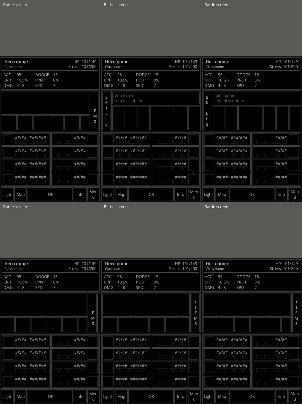
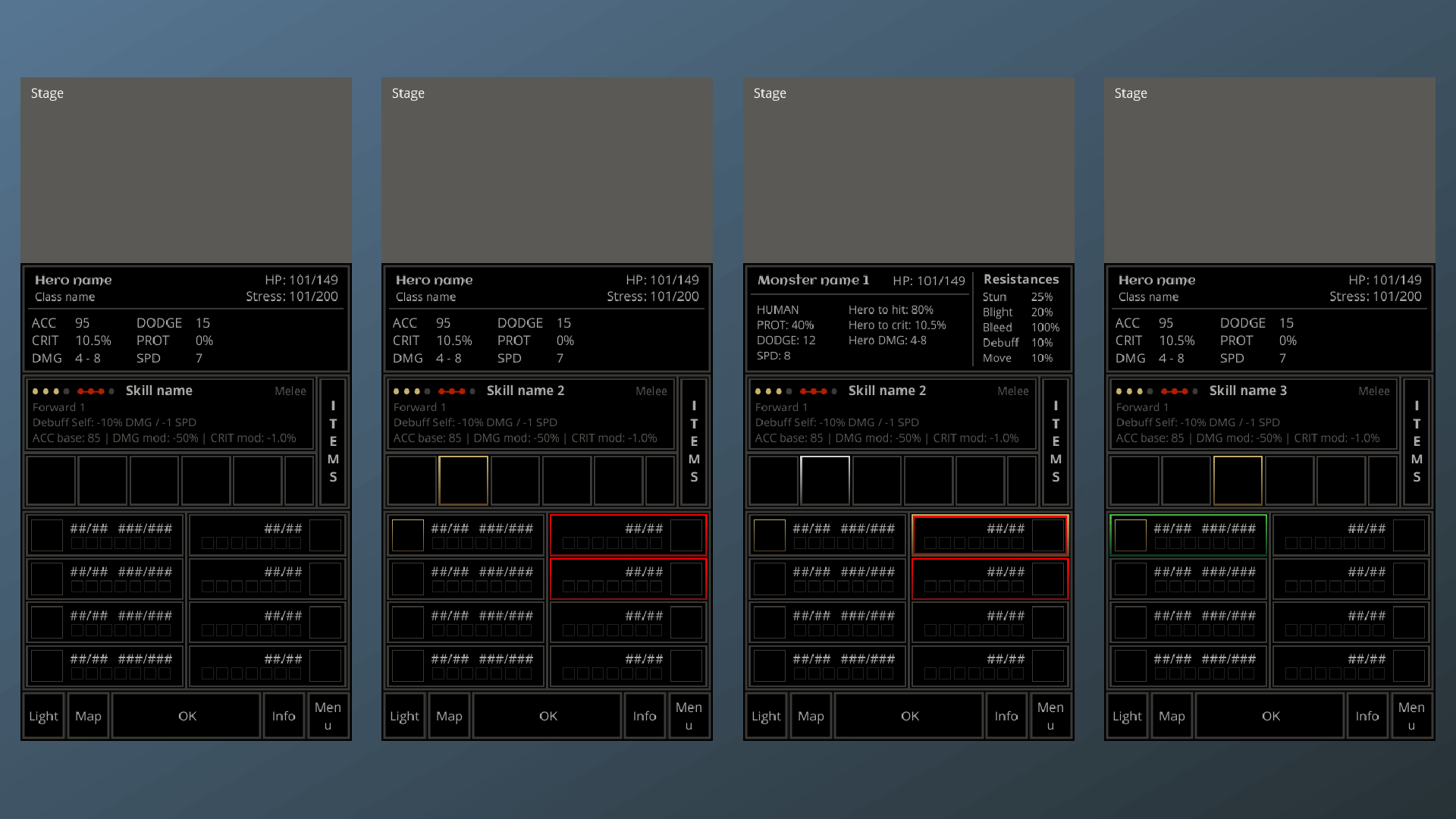
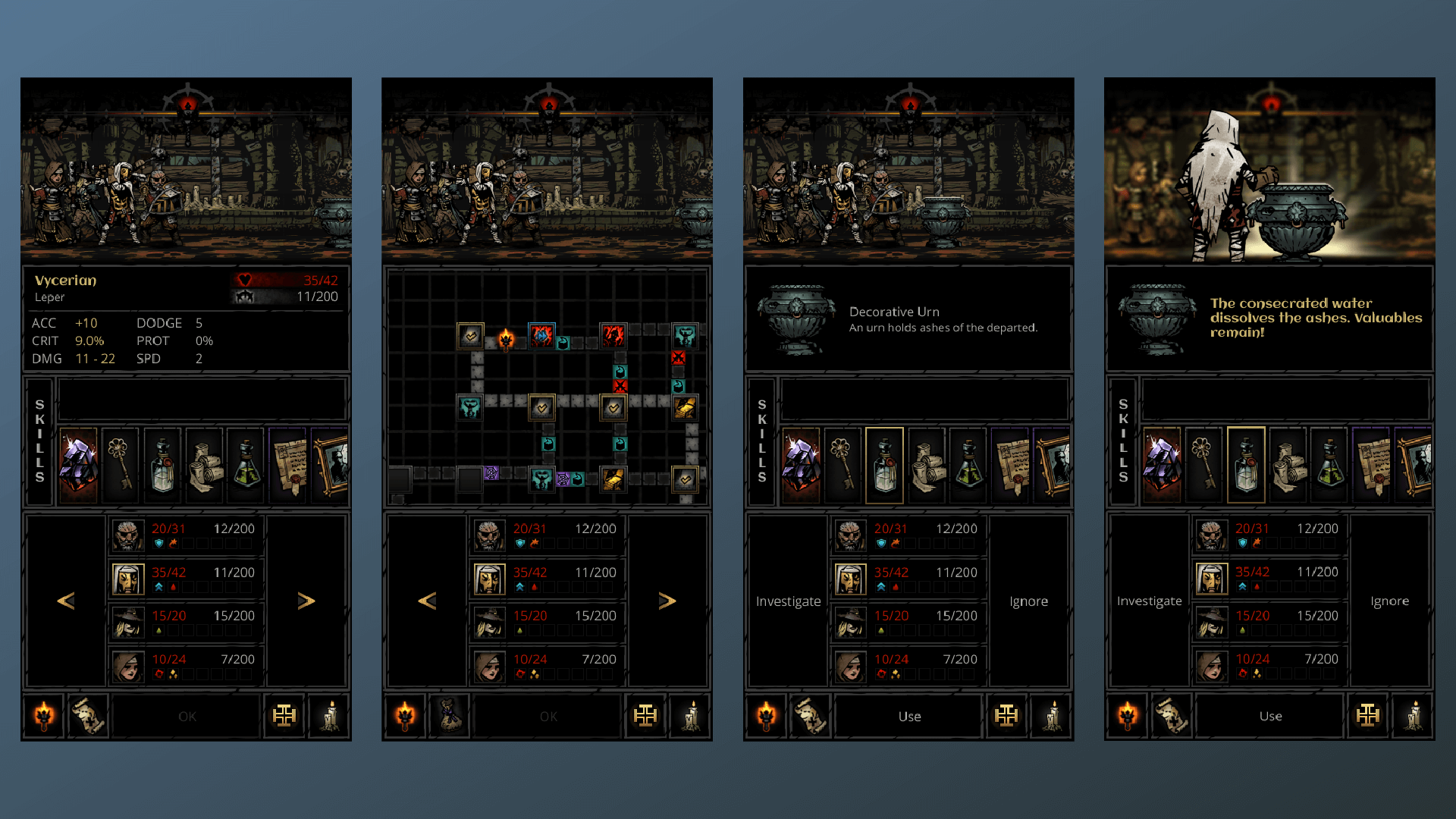
I first started with designing the stage since it was a shared element between the battling, exploring, and camping screens. The stage is the largest and most visual aspect of the game. The PC version presents the stage front and centre where you see your roster pitted against whatever the dungeon throws at you. Learning from early conceptualization, the stage also had to be displayed on a single plane. For the wireframe, the stage was designed to be as large as possible while still adhering to a single level. This was a little under ⅓ of the screen. Although ⅓ of the screen is small, the stage is used just for visuals in this mobile port. All the interactions are done through the UI which was given the rest of the screen. Also from the conceptualization stage, a selection area was needed to assist the smaller stage. Early concepts for the selection area only used face icons to represent each character on screen displayed in a single row. However with the large UI space, the selection area was expanded to incorporate the characters stats and names. A hybrid skill bar and item menu was added on top of the selection area. The skill bar and item menu were combined because the user would only ever need to use one or the other. Each bar has a respective description section in case the user forgets what a skill or item does. On top of the skill and item menu, a general information section was added. This was an all purpose information area. The user would see details on the selected hero or monster. In the exploration screen, the general information area would be used for curios and loot interactions. A bottom bar was added with options for the torch, map, and menu. A general action button was added in the center of the bottom bar as well. The action button will change depending on what the user has selected and disable if there are no actions to be made.

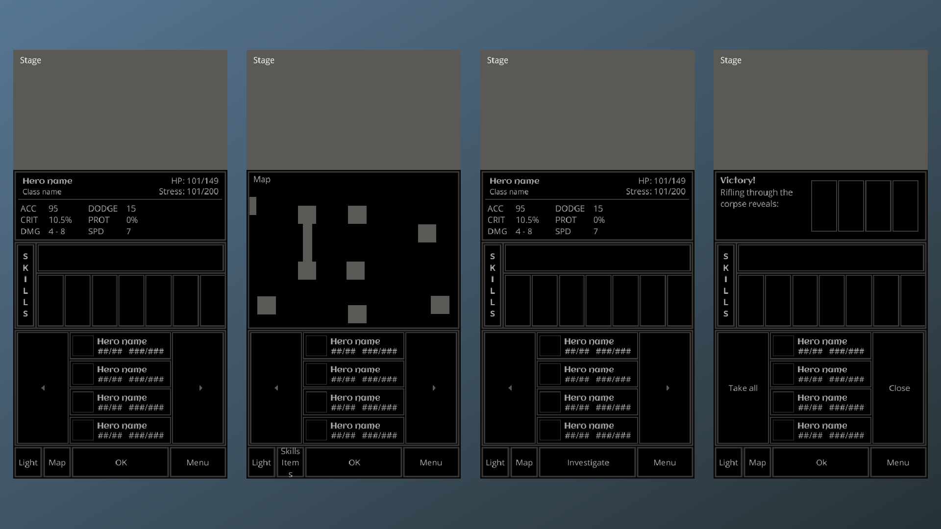
With the main battle interface created as a wireframe, I duplicated the screen to design the exploration interface. The exploration and battle interface shared most of the same areas except for the selection area. During exploration, there is no need for information on enemies. Therefore the enemy selection was removed, the hero roster was centered on the screen and two progression buttons were added to move the roster forward and backward through the dungeon.
With Figma, I was able to easily prototype all the different screens. Screens were duplicated in Figma and then strung together with the prototyping tool. Assets on one screen were tied to other screens so that when the user clicks on an asset, it would switch to the corresponding screen. Creating the prototype helped me test out the new interaction flow.
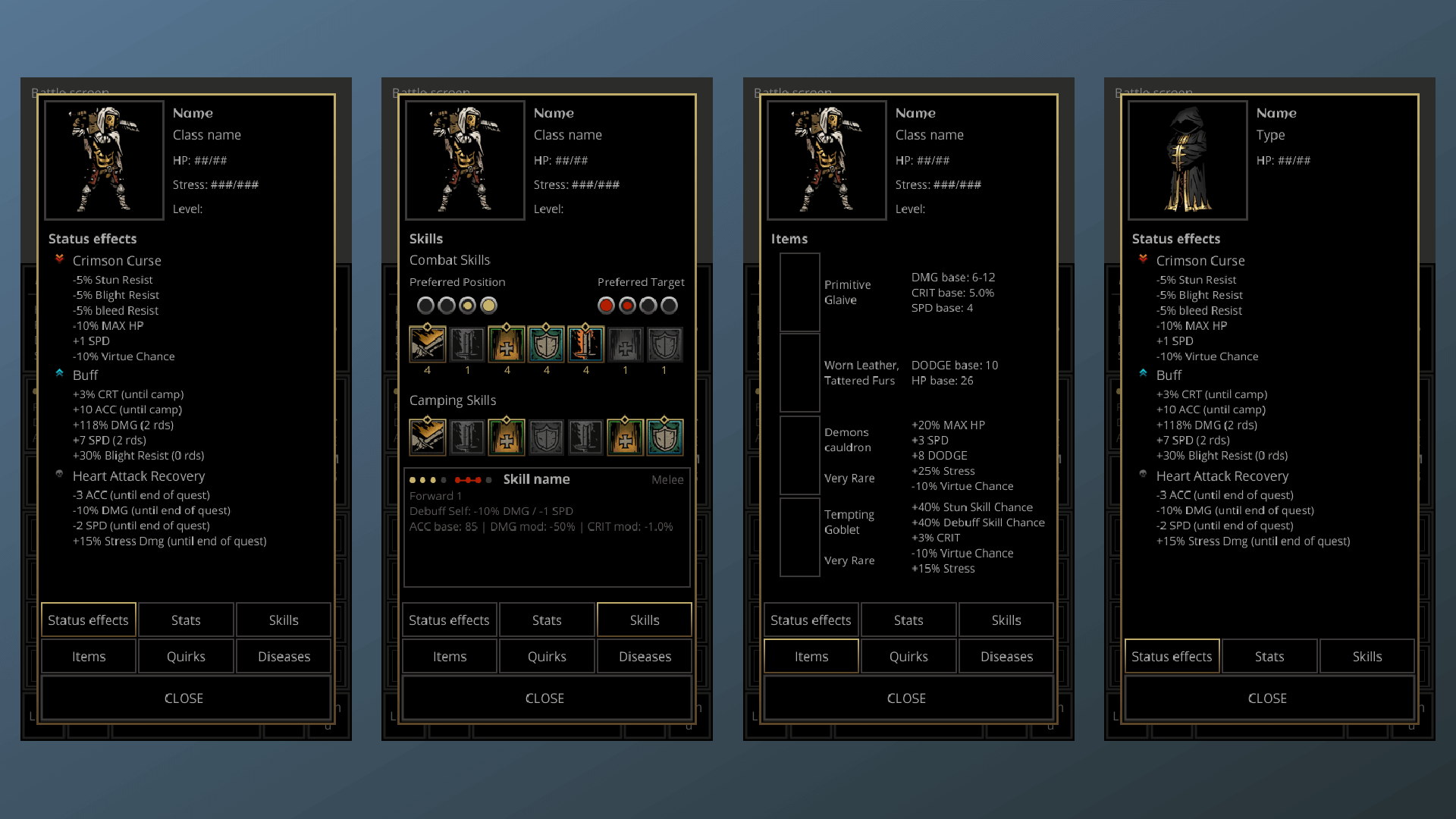
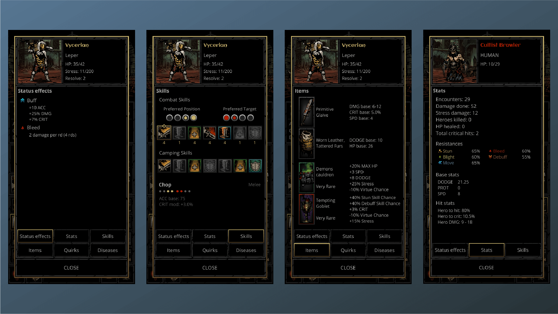
From the prototyping and testing phase, I discovered several flaws with my design. One element I overlooked was that the HP and stress bars were already incorporated into the selection area. Displaying those bars in the stage would be redundant and add to the already clustered screen. Another element was that the status effects that a user receives can be displayed in the selection area as well if I removed the names of the heroes and monsters. In addition, the general information area was too small to incorporate all the information that could be provided to the user. I played with the idea of swiping on the general information area for more information however, the number of screens required would be too many. The user would need to swipe left or right until they found the information they were looking for.Instead I opted to add a “more information” button to the bottom bar which would open a popup window for the user to get more information on the selected asset.
Assets
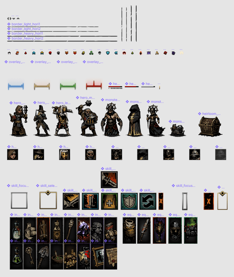
With the wireframes decided, production started with gathering the proper assets. Searching through the game files, you can find all the hero and monster assets. I decided to go with a normal roster which consisted of a Leper, Man-At-Arms, Grave Robber and a Vestal. A good mix of colours and sizes helps me judge if the assets work on a mobile screen. For the monsters I decided to go with a mix of cultists, and a skeleton corpse. Game UI assets can also be found in the game files, however most are built with a focus on a landscape orientation. Adjusting the assets would require heavy editing, therefore some assets were created in Photoshop instead to mimic the style of Darkest Dungeon.
Final design interfaces
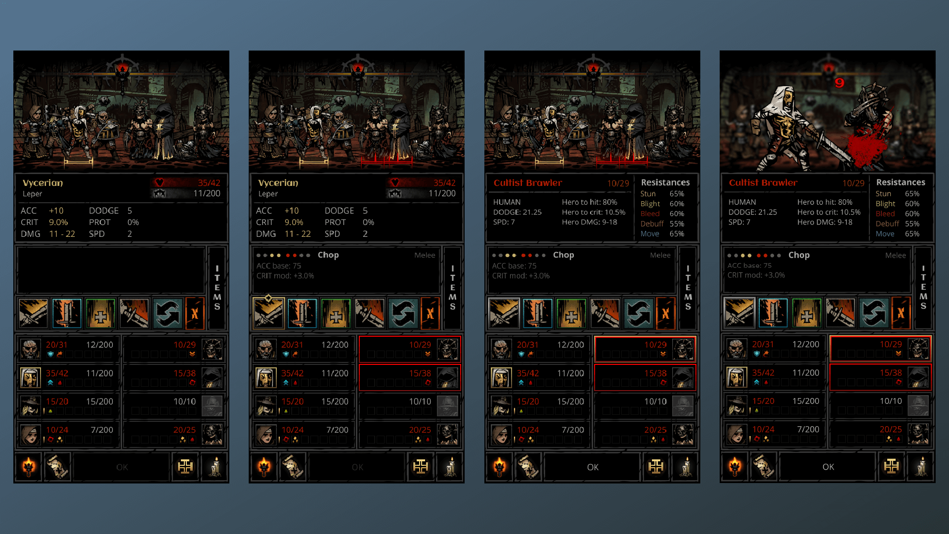
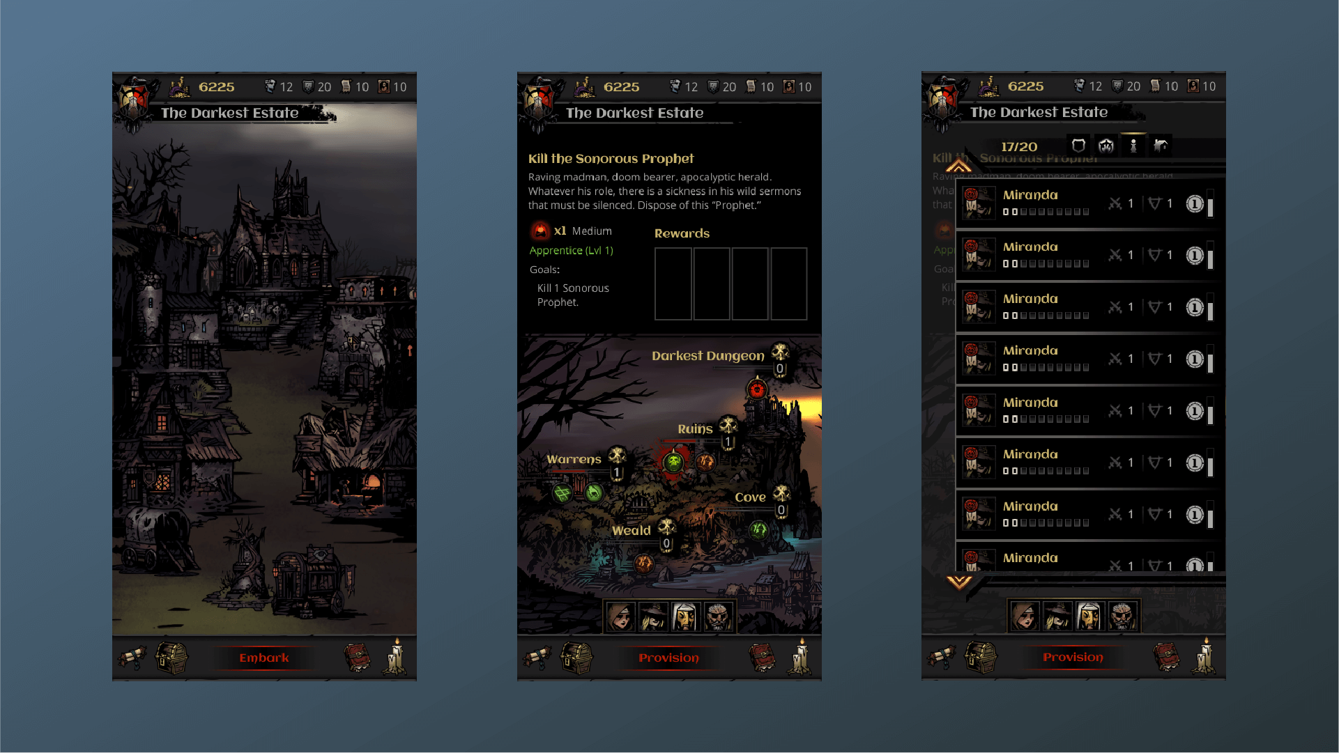
Most of the work depended on creating high quality wireframes. With the wireframes completed, creating the final interfaces consisted of dropping in the gathered game assets into the correct spots in the wireframes.
REFLECTION
Working on this project has taught me a lot on mobile interaction and working within the constraints of an already released game. Adapting a landscape PC game into a portrait mobile game taught me a lot on compromises and learning how to prioritize key elements in the interface. In addition, what options are available to me to hide away options that are not always needed. However, after this project I would keep the landscape orientation of Darkest Dungeon for a mobile port. Shrinking the stage to such a small portion of the screen takes too much away from the art and animation that made Darkest Dungeon so fun to play. Using interfaces that overlay the stage might have been a better choice. Portrait orientation for a mobile port only works if the user has a choice between portrait and landscape. The player could use the more visual landscape when they are playing the game more seriously, and then switch the portrait when commuting on a crowded public bus. However, designing the port in landscape orientation presents different problems like how to show the user the same amount of information provided by the portrait orientation. Overlay menus that hide and show throughout the game might have been a better choice. In addition, veteran players may not need all that information since they would know what to expect from each action. In this project, I went with the mentality that you could not provide too much information, especially in such a punishing game. All in all, I have learned a lot from this project and the lessons that I have learned could be applied to my next project, a game that could be continuously played on the desktop and then on mobile while on the go, stay tuned for more information.
